Static infographics, editorial
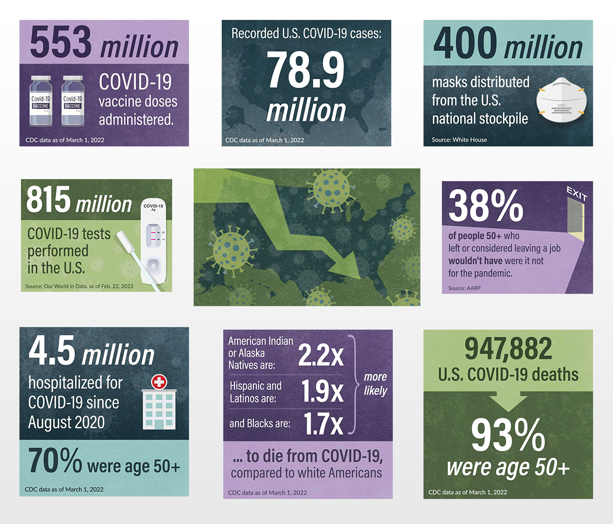
Infographics and promo image for "2 Years of COVID-19 by the Numbers" news article, March 2022. I worked closely with AARP's Health editor by providing reference examples, selecting which data to highlight, and copywriting/editing infographic text.

Infographics and promo image for "She's the Difference" series poll results article, September 2024. Again, I worked closely with AARP's senior politics editor to review and select poll data, determine what format and style the visuals would take, and finesse the copy.


Dynamic graphics, created with Infogram
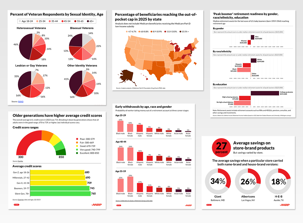
In 2023, I led the effort to test and implement two interactive data visualization platforms for AARP.org, creating 100+ on-brand infographics within the first six months that garnered 2M+ monthly views and increased user time on page.
For the rollout, I created templates for maps and common bar charts with colors, fonts and styling aligned to AARP brand guidelines. I created SOPs and learning sessions to train other design and production staff and ensured they were readily available on our Sharepoint hub. A few samples/links below.